UI and UX work becomes useful when someone can complete a real task with less uncertainty. A polished screen can support that task, but appearance alone cannot tell you whether people understand the choices or recover from a mistake. Learn to connect the user’s purpose, the sequence of actions, the interface and the evidence you have collected.

In this guide
If you are deciding whether this work suits you, compare it with the other options in which digital skill should I learn. The project below uses an invented neighbourhood workshop with a booking prototype. It gives you a concrete way to practise without implying that fictional visitors have been researched or that a design has improved a real business.
Learn the work behind the screen
UI design concerns the controls, layout, hierarchy and feedback people interact with. UX work also examines the wider task: why someone arrives, what information they need, what happens before and after the screen, and which constraints prevent completion. The responsibilities overlap, and job titles vary. Ask what a particular brief expects rather than relying on the label.
Start with observation and clear writing. Can you describe a user’s task without embedding your preferred solution? “A visitor needs to know whether a beginner can attend” leaves room to investigate. “A visitor needs a carousel” already assumes an interface. GOV.UK’s user-needs guidance is a useful primary reference for that distinction.
Practise visual hierarchy, spacing, typography and responsive layout alongside flows and interaction states. Learn enough accessibility to recognise labels, focus, contrast, meaningful order and error feedback. MDN’s accessibility module provides a foundation for web interfaces. A design file can record these requirements, but implementation must still be checked in the actual product.
Define the fictional booking task
Willow Workshop is an invented provider of beginner repair sessions. A visitor wants to find a suitable date, understand what to bring and request one place. The prototype uses two fictional dates and a fictional availability count. It does not make a real reservation or collect real personal data.
The practice brief asks for a workshop detail view, a date choice, a short request form and confirmation. Include the branch where the preferred date has no places and the case where a required field is missing. The constraint is a small-screen experience that can also be understood on a larger screen. Do not add membership, payment or account features.
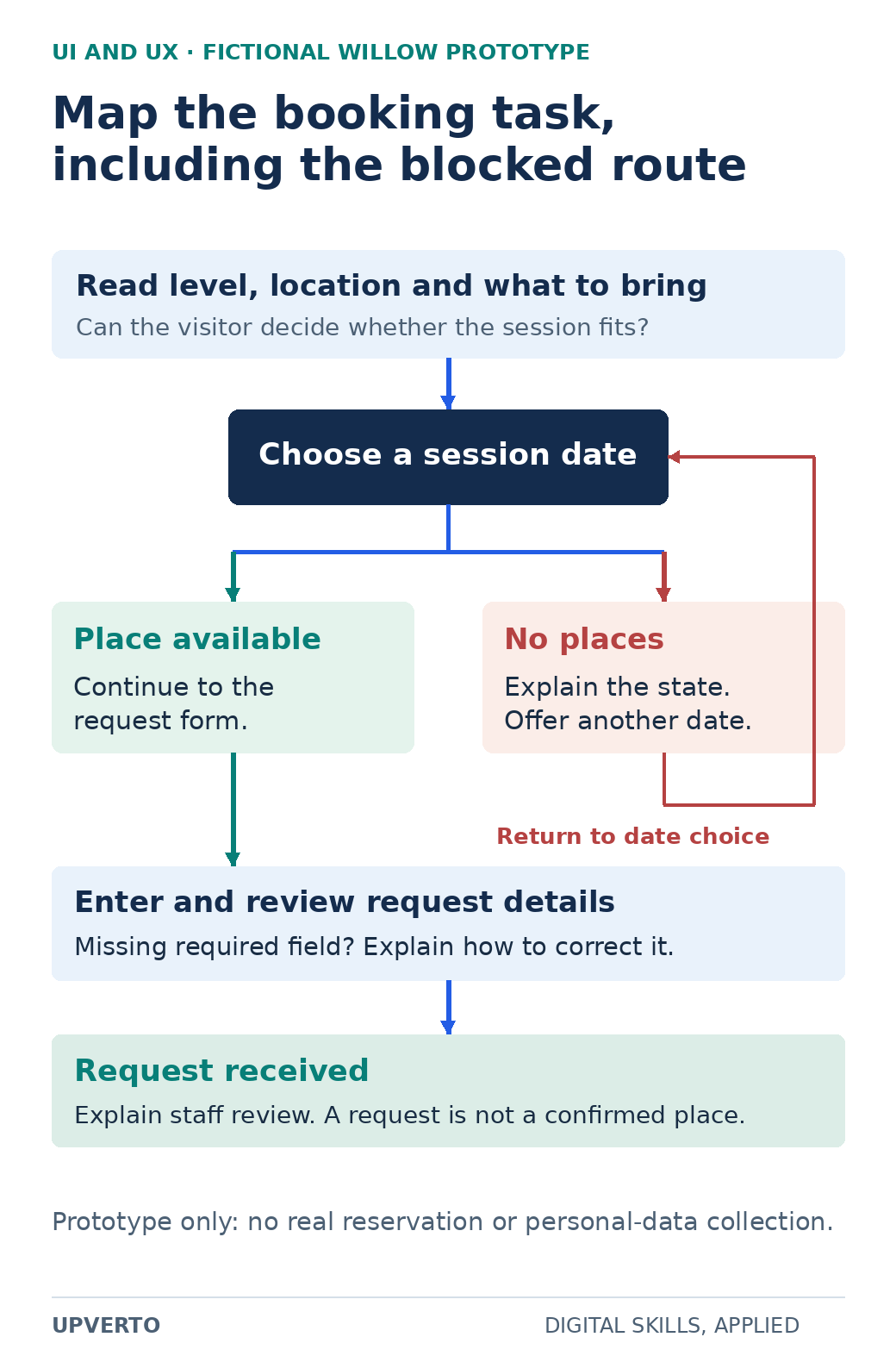
Read the text version: Map a booking task with an unavailable route
- Read the level, location and what to bring.
- Choose a date.
- If places are available, continue to the request form. If no places are available, explain the state and offer another date.
- Enter and review details; a missing required field needs clear correction guidance.
- Show request received and explain staff review. It is not yet a confirmed place.
This fictional prototype makes no real reservation.
The flow begins with a question: can the visitor decide whether the session fits? If the detail page omits the level or location, changing a button colour will not resolve that uncertainty. Place essential information before the booking action. When a date is unavailable, preserve context and offer another date. At confirmation, explain what the request means and what happens next.
Move from a rough flow to a testable prototype
Sketch the necessary states before choosing fonts. Give each state a name and each arrow an action. For example: workshop details → choose date → enter details → review request → request received. Keep error and unavailable states visible in the diagram. A single ideal path hides much of the work.
Create a low-detail prototype with realistic sample wording. “Continue” may be enough in one place; “Request a place” explains a different commitment. Decide whether confirmation is immediate or whether a staff member must approve the request. That decision belongs in the service design and the text, not only in the prototype links.
Check your own prototype against the brief before asking anyone to use it. Can all relevant controls be followed? Are the two dates consistent across screens? Does a missing field show where to correct the entry? A static mockup cannot prove keyboard behaviour or screen-reader output; record those as implementation requirements instead of claiming they passed.
Observe a task without inventing evidence
GOV.UK’s moderated usability-testing guidance describes watching participants attempt specific tasks. For a small practice session, explain that the interface is being tested, obtain consent for any notes or recording, and avoid collecting unnecessary personal information. Ask a neutral task, then watch what the person does before offering help.
A suitable task is: “You want to attend a beginner repair session next month. Find a date you could attend and request a place.” Avoid saying “Click the blue button,” because that supplies the action you wanted to observe. Use invented contact details and make it clear that no real place is being booked.
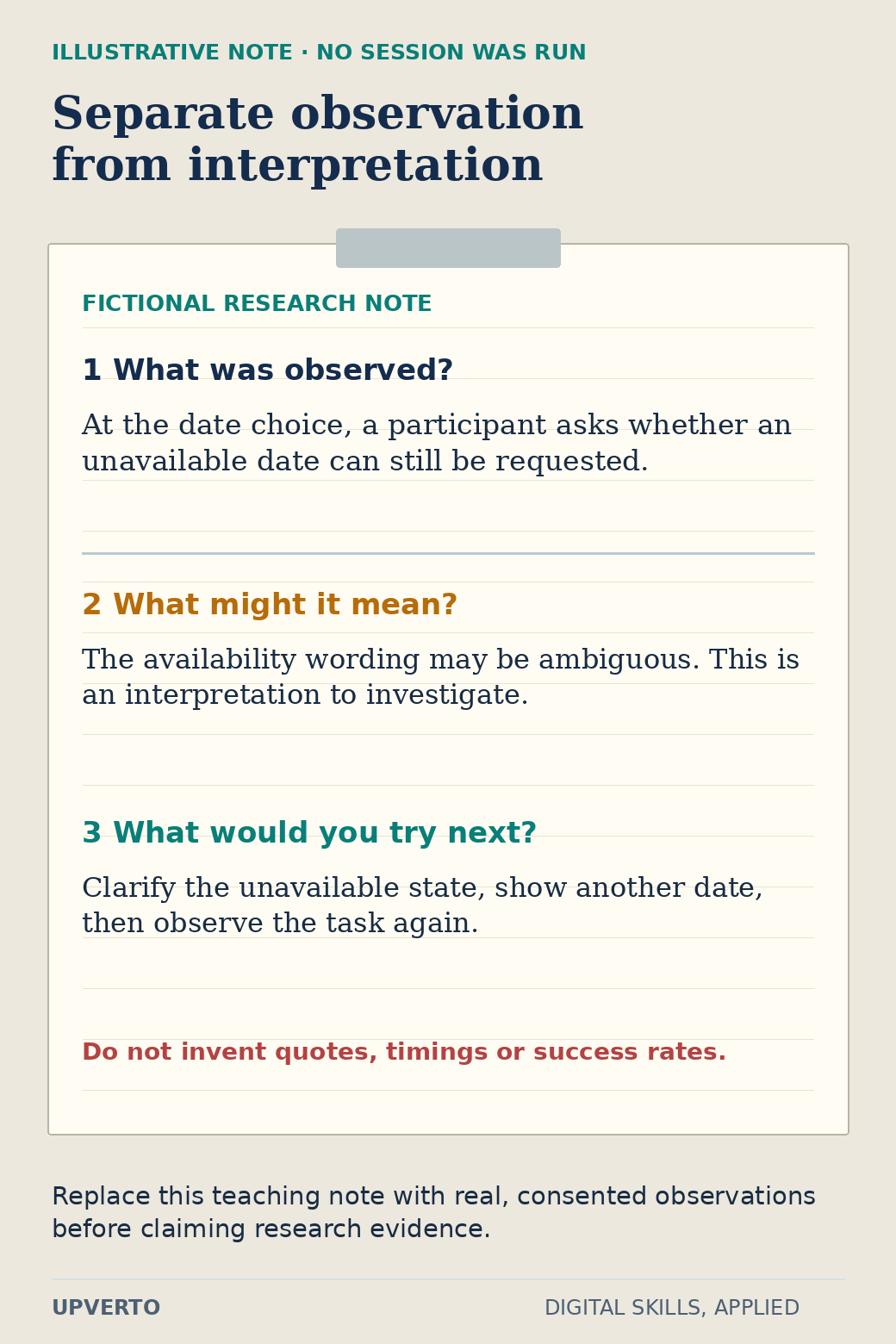
Read the text version: Turn an observation into a testable revision
- Illustrative observation
- A participant asks whether an unavailable date can still be requested.
- Interpretation
- The wording may be ambiguous; this requires investigation.
- Next design hypothesis
- Clarify the unavailable state, offer another date and observe the task again.
No session was run for this example. Do not claim invented quotes, timings or success rates as evidence.
The graphic contains an explicitly fictional observation note to demonstrate the format: at the date choice, a participant asks whether an unavailable date can still be requested. The corresponding design hypothesis is that the state needs clearer wording and an alternative. This note is an instructional example, not a report from an actual research session. If you run your own session, replace it with what you really observed.
Separate observation, interpretation and decision. “Paused for twelve seconds” is an observation only if you actually measured it. “Did not trust the service” is an interpretation requiring more evidence. A practical change might be to replace an ambiguous availability label, but that change remains a hypothesis until checked again.
Use this prototype case-study brief
| Field | What to record | Willow practice example |
|---|---|---|
| User and task | A concrete purpose and relevant context | First-time visitor choosing a beginner session |
| Known facts | Information supplied by the brief | Two fictional dates; staff review requests |
| Assumptions | Unverified beliefs needing investigation | Visitors understand the difference between a request and a confirmed place |
| States | Normal, unavailable, error and confirmation views | No places on one date; required contact field missing |
| Evidence | Actual observations and their source | Leave blank until a session occurs; mark illustrative notes as fictional |
| Decision | Specific change and why it may help | Clarify the unavailable-date message and show the alternative |
| Remaining limits | What the sample cannot establish | No live booking integration or measured business outcome |
Keep versions of the prototype so you can explain one meaningful revision. A case study becomes stronger when a reader can follow the reason for a change, inspect the relevant screen and see the limits of the evidence. Use write a portfolio case study when you turn those materials into a portfolio narrative.
Offer the part you can actually deliver
Possible bounded services include documenting an existing task flow, preparing wireframes from an agreed brief, or producing specified interface states for implementation. Research planning, participant recruitment, usability facilitation, accessibility auditing and production development each require additional competence and agreement. A prototype delivery does not automatically include them.
Before a project, agree the screens, states, device assumptions, supplied content, review rounds and handover format. Clarify who can approve changes and who will implement them. If the client requests evidence of improved usability, discuss an appropriate research method and what it can establish before promising a result.
For your learning sequence, use how to learn a digital skill to alternate a small concept with an applied task. Before offering paid work, compare the specific brief with the ready for paid client work checklist. Your immediate goal is an inspectable design decision and a clear handover, not a claim that attractive screens guarantee conversions.
Frequently asked questions
Can I learn UI design without becoming a researcher?
You can begin with interface craft and a clearly limited deliverable. Still learn to identify user tasks and distinguish evidence from assumptions. If research is outside your role, say who supplies it and avoid presenting an untested design as proven UX.
How many screens should my first prototype contain?
Use the states needed to complete one bounded task, including at least a relevant error or unavailable case. The Willow example needs more than a landing screen but does not need an entire service. Screen count follows the task rather than a portfolio quota.
Can friends take part in a practice usability session?
They can help you practise facilitation, provided they consent and understand the exercise. Explain how they differ from the intended users, avoid leading them, and do not generalise their responses to an entire audience.
May I use the fictional observation in the graphic as a research result?
No. It demonstrates how to separate a note, interpretation and revision. Label it as illustrative, or replace it with a real consented observation from your own session. Do not invent participant quotes, timings or success rates.
Does a clickable prototype prove accessibility?
It can communicate intended order, labels and error states, but it cannot establish all behaviour of a coded product. Record implementation requirements and check the real interface with appropriate methods before claiming conformance.
What should I hand over after a small UI project?
Provide the agreed screens and states, reusable styles where included, content assumptions, interaction notes and unresolved questions. Identify the version approved by the client and make clear whether implementation or further research is included.